The Impact of Color Temperature on Fabric and Wood
When shopping for furniture, you may fall in love with a color, fabric, or finish—only to find it looks different once it’s in your space. What changed?
The answer is lighting—and more specifically, color temperature. The warmth or coolness of your light can completely shift how your furniture is perceived. In this post, we’ll show you how color temperature impacts both fabrics and wood finishes, so you can choose pieces with confidence.
What Happens When Color Expectations Aren’t Met?
When lighting shifts how a fabric or finish appears, it can lead to unexpected results: a gray that suddenly looks blue, a walnut that reads red, or a beige that turns yellow. This mismatch between what you expected and what you see in your space can lead to disappointment—or worse, a costly return. That’s why understanding lighting is just as important as choosing the right material. It helps ensure the piece you fell in love with online still feels right at home.
Design Tip: Match Lighting to Mood and Materials
| Room Type | Ideal Lighting | Why It Works |
|---|---|---|
| Bedroom or Lounge | Warm (2700K–3000K) | Enhances softness, coziness |
| Modern Living Room | Neutral or Cool (4000K–5000K) | Neutral or Cool (4000K–5000K) Makes cool tones pop and keeps the space crisp |
| Dining Room or Showroom | Neutral (3500K–4100K) | Balanced, ideal for showcasing finishes |
border="1"
What Is Color Temperature?
Color temperature describes how warm or cool a light source appears, and it’s measured in Kelvin (K):
- Warm Light (2700K–3000K): Yellow-orange, cozy glow (think candlelight or incandescent bulbs)
- Neutral Light (3500K–4100K): Balanced white light, ideal for accurate color perception
- Cool Light (5000K–6500K): Bright, bluish light similar to daylight or LED panels
Each type affects how materials look—especially textiles and wood tones.
How Fabric Colors React to Lighting
| Type of Lighting | Enhances | Distorts |
|
Under Warm Lighting (2700K–3000K) |
Browns, rusts, olive greens, beiges | Cool colors like grays or blues may appear muted or muddy |
|
Under Cool Lighting (5000K–6500K) |
Cool tones like navy, charcoal, and teal | Warm fabrics can look washed out or sterile |
|
Under Neutral Lighting (3500K–4100K)
|
Best for accuracy. Gives a true-to-color reading of most fabrics, especially helpful for online shoppers. |
How Wood Finishes Shift with Color Temperature
Wood has natural warm or cool undertones, which are amplified—or toned down—by the light:
Warm Light
- Makes wood feel richer and deeper
- Walnut looks warmer and more golden
- Oak appears golden or amber
Cool Light
- Leans wood toward gray or ashy tones
- Can reveal cooler or hidden undertones
- May flatten warm woods visually
Neutral Light
Gives a balanced view of wood grain and tone, making it ideal for showrooms or photos.
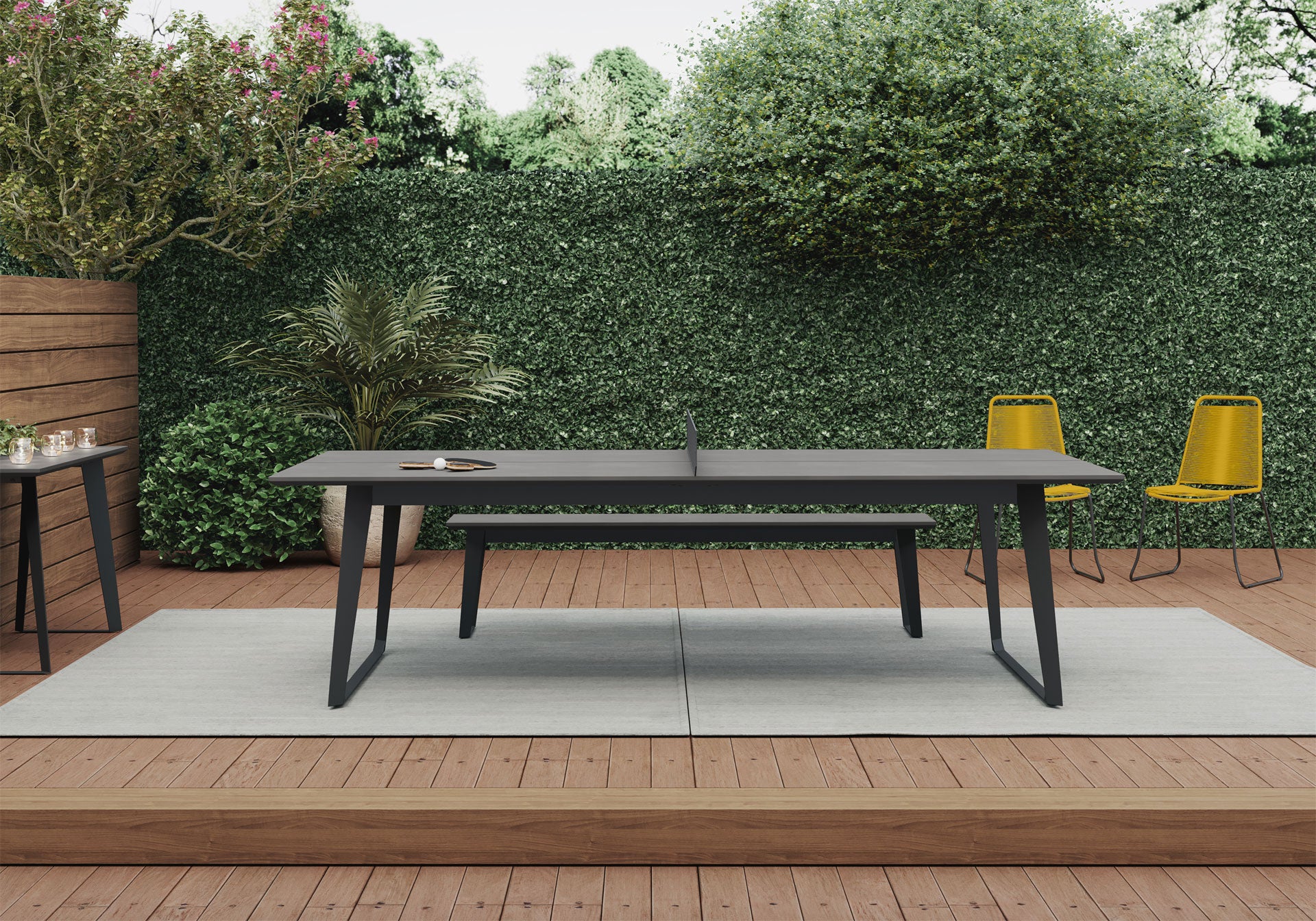
Why Lighting Matters in Online Furniture Shopping
Most product images are taken under neutral or cool lighting to show details clearly. But in your home, your existing lighting may be warmer, which will change how those materials look.
That’s why we recommend:
- Viewing reference photos under various lighting types
- Knowing your home’s lighting setup before selecting finishes
- Using adjustable bulbs or dimmers for flexibility
Lighting Is the Unsung Hero of Interior Design
Lighting doesn’t just help you see—it changes how you feel about every material in your room. From soft linen to bold walnut, color temperature can make your furniture look dramatically different.
Before you decide on a piece, consider how it will look in your lighting, not just ours.
See It In Every Light
Not sure how a finish will appear in your space? Reach out to us!